top of page

Anchor 1
Visual Communication
Jan–Apr 2020
Dating Visualisation
Dating visualisation is an interactive channel that matches its users to their destinated online dating platform, through a series of time-based data gathered from secondary research. The goal of the platform is to address the existing pain points users faced when looking for their other half. Captivating users' attention and interests towards the trivial online dating platforms.

Background
%20%E2%80%93%206.png)
To visualise a time-based narrative, this project introduced various forms of data visualisation may take and how these may be animated to show the dynamism of its changes. Before commencing the project, '5 HAT RAT' (Category, chronology, location, alphabetical, continuum) was introduced to us to get a better idea of how we could potentially frame our research approach.
Research Data
The value behind choosing Dating Platform as a topic was because of how dynamic the data was. The marketing strategy adopted and the way it changed the overall e-commerce game was found to be extremely intriguing as a budding designer. Part of the data used to make this project happen are as follow:
Design Process
Online dating websites (Global)
Online dating app (India)
Online dating app (Singapore)
Online dating app (UK)
Online dating app (US)
Consolidated study data of US,UK & CHINA
Top 32 dating platform evaluation
Industry data here
Analog
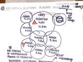
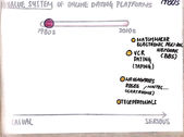
As visual creatures, numbers can sometimes be daunting to digest which inspired us to transform these data into low-fidelity sketches.

Design Iterations


The first design proposed embodies a retro-like browser style to channel the qualities of a dating platform. As there was 3 aspect to visualising the data of how dating platforms had evolved, hence resulting in proposing 3 varying platforms.


The next design iteration was more interactive, allowing users to manipulate the options as they pleased.
However, the visual language of the proposed platform was not consistent.


Before the design language was finalised, the third iteration brought out a much more cohesive design and visual language across all the three-layers proposed. Although the approach was consistent, however, the overall concept and narrative lacked an impact on its users.
Flowchart

Untitled-1-01

Untitled-1-02

Untitled-1-20

Untitled-1-01
1/20
To define the impact of the narrative, some risks were taken to explore something different by interpreting the data into a possible flowchart, that matches its users to their dating platform by asking/answering a series of specific questions.
The Narrative
Personal emotional rating to this project:
Project supervised by: Prof. R. Brian Stone
Thank you for reading!
bottom of page


